Kitchen cabinet colors set the tone for the entire space, and 2026 is delivering bold, thoughtful palettes that go far beyond cookie-cutter builder-grade white. Whether you’re planning a full remodel or refreshing cabinet finishes, understanding which modern kitchen cabinet colors work best for your space and lifestyle is crucial. Homeowners and DIY enthusiasts are moving away from trends that looked dated within three years and investing in colors backed by solid design principles, think carefully curated neutrals, statement-making jewel tones, and warm earth palettes that age gracefully. The right cabinet color maximizes natural light, complements your countertops and hardware, and creates a kitchen that feels both current and timeless. Let’s explore the seven trending cabinet color palettes that are defining contemporary kitchens this year.
Table of Contents
ToggleKey Takeaways
- Modern kitchen cabinet colors in 2026 prioritize thoughtful design principles over fleeting trends, with gray, greige, bold jewel tones, and warm earth palettes defining contemporary spaces.
- Gray and greige cabinets remain the most versatile modern kitchen cabinet colors, working seamlessly with virtually any countertop and hardware finish while creating a sophisticated backdrop.
- Bold cabinet colors like navy, deep forest green, and black create visual weight and intentional design but require excellent lighting and lighter countertops to prevent the space from feeling cramped.
- Two-tone cabinet designs allow homeowners to incorporate statement colors on a smaller scale while adding visual depth and preventing any single color from overwhelming the kitchen.
- Successful modern kitchen cabinet colors depend on coordinating the cabinet shade with countertops, hardware finishes, and lighting to create a balanced, cohesive design system.
- Test cabinet color samples under all lighting conditions—morning, afternoon, and evening—before committing to installation, as lighting quality dramatically affects how colors appear and make the space feel spatially.
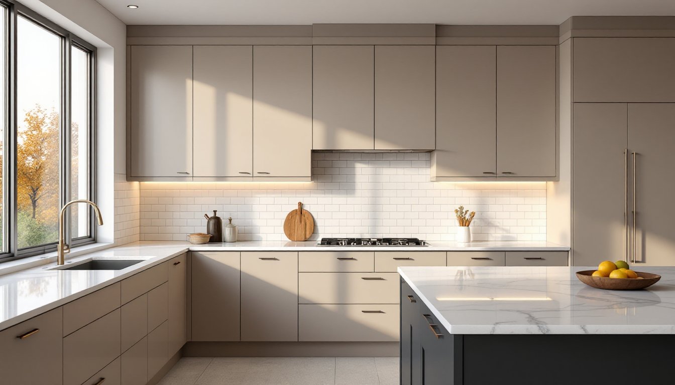
Neutral Elegance: Gray and Greige Dominate Contemporary Kitchens
Gray and greige (a warm blend of gray and beige) remain the backbone of contemporary kitchen design for good reason. These neutral cabinet colors work with virtually any countertop material, backsplash style, and hardware finish, making them the safest long-term investment.
True gray cabinets, think soft charcoal, dove gray, or warm gray, create a sophisticated backdrop that draws attention to your countertops and backsplash rather than competing with them. Greige is slightly warmer than pure gray: it leans into subtle beige undertones that prevent kitchens from feeling cold or institutional. Most greige palettes read as “warm neutral” under different lighting conditions, which matters if your kitchen has north-facing windows or limited natural light.
When selecting gray or greige, consider the light reflectance value (LRV) of your paint or cabinet finish. An LRV of 50–70 feels light and airy: 30–50 reads as medium and grounded. Test samples on your actual cabinet doors under your kitchen’s lighting, morning light, afternoon light, and evening artificial light all shift perception. Pair gray or greige cabinets with stainless steel or brushed nickel hardware for a clean, minimal look, or mix in brass or bronze for warmth.
Bold Statement Colors: Navy, Deep Green, and Black
Bold cabinet colors are having a defining moment in 2026, and homeowners willing to commit are seeing stunning results. Navy blue, deep forest green, and charcoal-black cabinets create visual weight and anchor a kitchen, making the space feel intentional and curated rather than generic.
Navy is the most versatile of these bold choices, it reads differently depending on undertones. A true navy with blue undertones pairs beautifully with brass hardware and marble countertops. Navy with subtle purple undertones (sometimes called “navy noir”) works well with warm wood islands or terracotta backsplashes.
Deep green has emerged as the favorite among design-forward homeowners. Rich, saturated greens like forest green or hunter green feel organic and calming, particularly in kitchens with abundant natural light. Green cabinets work exceptionally well with brass or gold hardware, live-edge wood countertops, and soft white subway tile backsplashes. Black or charcoal cabinets demand confidence, they’re striking, sophisticated, and require bright countertops or backsplashes to prevent the kitchen from feeling cave-like. Black cabinets show fingerprints and dust easily, so glossy or semi-gloss finishes are less practical than matte finishes for busy households.
Bold colors require more planning. Ensure your kitchen has adequate lighting, under-cabinet lights, pendant lights, and good overhead illumination prevent dark cabinets from making the space feel cramped. Pair bold colors with lighter countertops and backsplashes for balance.
Warm Earth Tones: Terracotta, Sage, and Warm Taupe
Warm earth tones bring organic, grounded energy to modern kitchens and feel less sterile than cool grays. Terracotta, sage green, and warm taupe are gaining traction as homeowners seek color palettes that feel connected to nature without veering into overly rustic or farmhouse aesthetics.
Terracotta cabinets, a warm, muted orange-red inspired by clay, pair beautifully with natural wood accents, warm metals like copper or brass, and earthy countertops like slate or warm granite. Terracotta reads as inviting and creative without being trendy in a way that feels disposable. It’s particularly effective in kitchens with wooden open shelving or a wood island.
Sage is the go-to soft green for kitchens seeking warmth without boldness. It’s muted enough to feel calm and sophisticated but warm enough to complement wood tones and bronze hardware. Unlike the deep forest greens trending in coastal and contemporary spaces, sage reads as approachable and livable. Warm taupe, richer and more sophisticated than beige, offers similar versatility to gray but with underlying warmth that prevents the space from feeling cool.
These earth tones work exceptionally well in kitchens designed with natural materials: exposed beams, stone countertops, or reclaimed wood islands. They’re also forgiving under various lighting conditions, as the warm undertones help cabinets glow rather than recede. Test samples in your specific space: warm earth tones can shift dramatically based on the undertones in your walls and existing fixtures.
Two-Tone Cabinet Design: Mixing Colors for Visual Interest
Two-tone cabinet design, pairing contrasting colors for upper and lower cabinets, or using an island in a different shade than perimeter cabinets, is a powerful way to add depth without overwhelming the space. This approach lets homeowners commit to bold colors on a smaller scale.
Common two-tone combinations: white uppers with gray, navy, or green lowers: light gray uppers with charcoal or black lowers: warm white uppers with terracotta or sage lowers. The contrast prevents any single color from dominating and draws the eye around the kitchen in a dynamic way.
When planning a two-tone scheme, ensure the two colors have compatible undertones. A cool blue-gray upper cabinet next to warm terracotta lowers can feel discordant. Think about which cabinets receive the most visual attention, island cabinets are seen first and longest, so they’re ideal for your statement color, while upper cabinets running along walls can go lighter to keep the space feeling open. Match cabinet hardware across both colors for visual cohesion, or use coordinating finishes (brass on both, for instance) rather than clashing metals.
Pairing Cabinet Colors With Countertops and Hardware
Cabinet color decisions don’t exist in isolation, they’re part of a complete kitchen palette that includes countertops, backsplash, and hardware. The most successful modern kitchens treat these elements as a coordinated system.
Gray and greige cabinets are the most flexible: they work with white, cream, or light gray countertops for a minimalist look: marble for elegance: or warm wood tones for contrast. Navy and deep green cabinets shine with marble, light granite, or engineered quartz in whites, creams, and soft grays. Avoid pairing dark cabinets with very busy or dark countertops, which muddy the visual hierarchy.
Warm earth tones (terracotta, sage, warm taupe) pair naturally with warm countertop materials: granite with honey or rust tones, slate, soapstone, or wood. These combinations feel cohesive and intentional. Hardware choices amplify the palette’s mood: stainless steel feels industrial and cool: brass feels warm and vintage-inspired: matte black feels contemporary: brushed nickel feels clean and transitional.
Research kitchen cabinet color ideas from professional designers to see how specific cabinets, countertops, and hardware work together in real kitchens. Seeing finished projects helps you understand how your chosen color will actually live in a completed space, not just in paint chips.
Lighting and Space Considerations for Cabinet Colors
Cabinet color choices have profound impacts on how a kitchen feels spatially and functionally. Light colors, whites, creams, soft grays, make kitchens feel larger and brighter, especially in smaller or north-facing spaces. Dark colors, navy, deep green, black, ground a space and make it feel more intimate, which works beautifully in larger kitchens but can make compact kitchens feel cramped.
Lighting quality and quantity directly affect how cabinet colors read. A white kitchen flooded with natural light feels fresh and clean. The same white kitchen with only overhead lights can feel cold and sterile. Bold colors like navy and deep green require excellent lighting to prevent the space from feeling dark. Install under-cabinet LED lights (warm white, 2700K color temperature) to brighten the lower half of the kitchen and add warmth. Pendant lights over islands and overhead recessed lights complete the lighting scheme.
Small kitchens benefit from light or medium-tone cabinets paired with light countertops and bright backsplashes to maximize reflectivity and visual space. Large kitchens can handle darker, bolder cabinet colors that create definition and keep the space from feeling cavernous. Explore kitchen design inspiration and professional remodels to see how different spaces use color and lighting to feel balanced and purposeful. Test your chosen cabinet color under all lighting conditions in your kitchen before committing to the full installation.
Conclusion
Modern kitchen cabinet colors in 2026 reflect a shift toward thoughtful, intentional design rather than trend-chasing. Whether you gravitate toward the timeless sophistication of gray and greige, the visual power of navy and deep green, the warmth of terracotta and sage, or the creativity of two-tone schemes, your choice should align with your kitchen’s light, layout, and how you actually live in the space. Test paint samples under your specific lighting, consider the long-term appeal of your chosen color, and pair your cabinets thoughtfully with countertops and hardware. The best cabinet color is one you’ll love opening every morning and one that makes cooking, gathering, and living in your kitchen feel genuinely good.